Подскажите пожалуйста, почему панель разработчика не на всю ширину окна располагает элементы (body к примеру), когда я сужаю окно для настройки адаптива? Ширина body каждый раз меняется, хотя в стилях он даже не прописан, должен быть на всю ширину окна поидее. Из-за этого просто невозможно настроить адаптив. Что посоветуете? Может есть другие панели разработчика, которые работают лучше или у меня в коде все таки проблемы?
Залил страницу на хостинг:
https://damruss.github.io/exp1/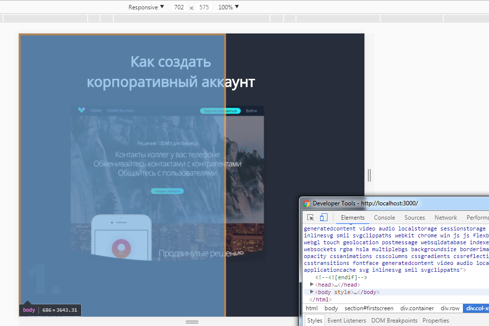
<body>
    <section id="firstscreen">
        <div class="container">
             <div class="row">
                  <div class="col-xs-12 firstscreen">
                     <h1>Как создать корпоративный аккаунт</h1>
                 </div>
            </div>
            <div class="row">
                <div class="col-md-6 col-xs-12 firstscreen_col1">
                    <img class="firstscreen_col1_bgmobile" src="img/В работе/решения.png" alt="Решения 100АМ"><br>
                    <div class="firstscreen_col1_part1">
                        <span>1.</span>
                        <p>Зайдите на страницу</p>
                        <a href="linkhttps://www.100am.co/business/">https://www.100am.co/business/
                        <img class="firstscreen_col1_img_icon" src="img/В работе/link_icon.png" alt="Иконка ссылки"></a>
                        <p>и нажмите</p>
                        <button class="firstscreen_col1_btn1"><div class="firstscreen_col1_btn1_title">Создать аккаунт
                        </div></button>
                        <div class="firstscreen_col1_text_ili">или</div>
                        <button class="firstscreen_col1_btn2"><div class="firstscreen_col1_btn2_title">Зарегистрироваться
                        </div></button>
                        <img class="firstscreen_col1_lines" src="img/В работе/col1_lines.png" alt="Линии">
                        <img class="firstscreen_col1_lines_point" src="img/В работе/col1_lines_point.png" alt="Указатель">
                    </div> <!-- column 1 part 1 -->
                    <div class="firstscreen_col1_part2">
                        <span class="firstscreen_col1_span_2">2.</span>
                        <p class="firstscreen_col1_part2_header">Введите название компании</p>
                        <p class="firstscreen_col1_part2_text">(Используется как название группы, название компании в карточках участников можно изменить)</p>
                        <img class="firstscreen_col1_team" src="img/В работе/new_team.png" alt="Create new team">
                    </div> <!-- column 1 part 2 -->
                </div>
                <div class="col-md-6 col-xs-12 firstscreen_col2">
                    <div class="firstscreen_col2_part1">
                          <img class="firstscreen_col2_part1_bg" src="img/В работе/решения.png" alt="Решения 100АМ">
                          <span>3.</span>
                          <p class="firstscreen_col2_part1_header">Введите почту, на которую будет зарегистрирован аккаунт</p>
                          <p class="firstscreen_col2_part1_text">(На эту почту не должен быть зарегистрирован личный аккаунт)</p>
                          <img class="firstscreen_col2_part1_team" src="img/В работе/col2_email.png" alt="Enter email">
                    </div> <!-- column 2 part 1 -->
                    <div class="firstscreen_col2_part2">

                    </div> <!-- column 2 part 2 -->
                </div>
            </div>
        </div>
    </section>
  </body>
</html>
@media (min-width: 481px) and (max-width: 768px) {
	#firstscreen {
		margin: 0px;
	}
	.firstscreen {
		padding-bottom: 0%;
		h1 {
			.opn-reg;
			color: white;
			font-size: 48px;
			text-align: center;
			position: relative;
			left: -275px;
			margin-left: 50%;
			width: 570px;
		}
		&_col1 {
			position: relative;
			top: -40px;
			span {
				font-family: 'Open Sans', sans-serif;
				font-weight: 800;
				color: #333a49;
				font-size: 140px;
			}
			a {
				display: inline-block;
				width: 330px;
				height: 47px;
				text-align: center;
				-webkit-border-radius: 10px;
				-moz-border-radius: 10px;
				-ms-border-radius: 10px;
				-o-border-radius: 10px;
				border-radius: 10px;
				background-color: #1b232f;
				padding-top: 1.5%;
				text-decoration: underline;
				font-size: 18px;
			}
			&_part1 {
				p {
					margin: 14px 0px 14px 9px;
					font-size: 18px;
					color: white;
				}
			}
			&_part2 {
				position: relative;
				top: -360px;
				&_header {
					.opn-reg;
					font-size: 23px;
					top: 399px;
					width: 400px;
					color: white;
				}
				&_text {
					.opn-reg;
					font-size: 16px;
					top: 440px;
					width: 450px;
					text-align: left;
					color: @base_dtext;
				}
			}
			&_img {
				&_icon {
					height: 17px;
					width: 17px;
					margin-left: 5px;
				}
			}
			&_span {
				&_2 {
					position: relative;
					top: 20px;
				}
			}
			&_bgmobile {
				height: 536px;
				width: 664px;
				margin-left: 50%;
				position: relative;
				left: -332px;
				top: 50px;
			}
			&_btn1 {
				height: 47px;
				width: 158px;
				-webkit-border-radius: 40px;
				-moz-border-radius: 40px;
				-ms-border-radius: 40px;
				-o-border-radius: 40px;
				border-radius: 40px;
				background: linear-gradient(to right, #1be9fd 0%, #3bffb7 100%);
				border: 0px;
				font-size: 16px;
				&_title {
					color: black;
					.opn-bold
				}
			}
			&_text_ili {
				display: inline;
				font-size: 18px;
			}
			&_btn2 {
				height: 47px;
				width: 195px;
				-webkit-border-radius: 40px;
				-moz-border-radius: 40px;
				-ms-border-radius: 40px;
				-o-border-radius: 40px;
				border-radius: 40px;
				background: linear-gradient(to right, #1be9fd 0%, #3bffb7 100%);
				border: 0px;
				font-size: 16px;
				&_title {
					color: black;
					.opn-bold
				}
			}
			&_lines {
				height: 511px;
				width: 240px;
				margin: 20px 0px 0px 80px;
				display: block;
				&_point {
					margin: 500px 0px 0px -179px;
				}
			}
			&_team {
				position: relative;
				height: 187px;
				width: 354px;
				left: 0px;
				top: 35px;
			}
		}	// col1
		&_col2 {
			span {
				position: relative;
				top: 106px;
				font-family: 'Open Sans', sans-serif;
				font-weight: 800;
				color: #333a49;
				font-size: 114px;
			}
			&_part1 {
				&_bg {
					position: relative;
					width: 514px;
					height: 459px;
					top: 30px;
				}
				&_header {
					.opn-reg;
					font-size: 23px;
					top: 87px;
					width: 564px;
					color: white;
					display: inline-block;
					position: relative;
				}
				&_text {
					.opn-reg;
					font-size: 16px;
					top: 70px;
					width: 508px;
					text-align: left;
					color: @base_dtext;
					display: inline-block;
					position: relative;
				}
				&_team {
					height: 262px;
					width: 355px;
					top: 104px;
					position: relative;
					display: block;
				}
			} 		// part1
		}		// col2
	}		// firstscreen
}


 Средний


